Northshore local business owners and organizations often do solid work, yet small business marketing can look uneven from one place to the next. When a logo shifts, colors change or photos feel like they came from different businesses, visual branding inconsistency creates customer trust challenges before anyone makes contact. That gap can quietly weaken brand trustworthiness, even for reliable services and long-standing teams. A clearer, more consistent visual presence helps customers recognize the business quickly and feel confident they’re dealing with the same operation every time.
Quick Summary: Trust-Building Visual Branding
- Use a consistent visual identity to help customers recognize your business quickly and reliably.
- Choose authentic brand imagery that reflects your real people, products and values.
- Apply simple, professional design touches to look credible without a full rebrand.
- Focus on budget-friendly branding steps that improve trust and clarity starting today.
Understanding a Brand Identity System
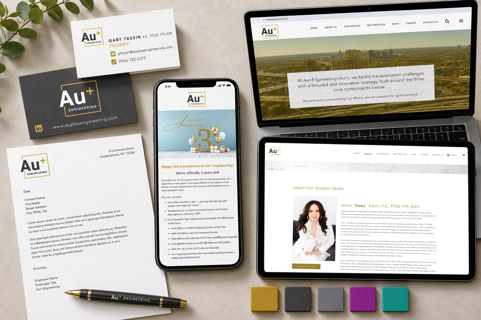
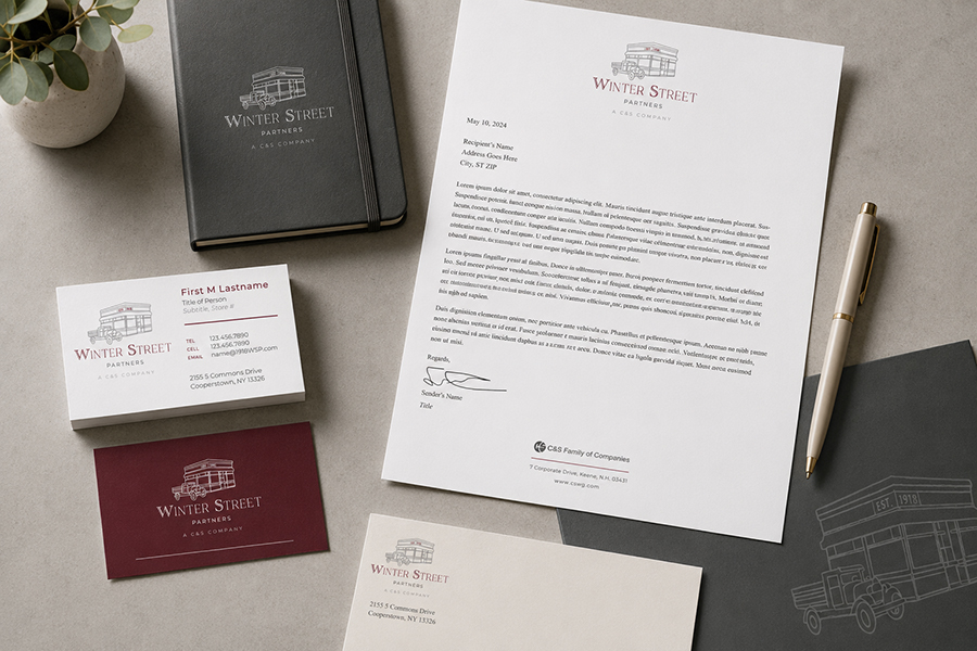 A brand identity system is the repeatable set of choices that shows who you are, everywhere people meet you. Brand identity is the essence of your business, so start by naming your values and mission in plain words. Then match those words to a few visual identity basics like color, type and graphics so each piece looks related.
This matters because customers judge credibility fast, often before they read a full sentence. Using logos, typography and color palettes consistently reduces mixed signals and helps you look steady and reliable.
Think of a neighborhood bakery that uses the same warm colors, friendly font and simple icon on signs, menus and social posts. Even with different offers each week, it still feels like the same place. That familiarity makes first time visitors more willing to try.
Apply These Low-Cost Design Moves Without Losing Professionalism
When budgets and time are tight, trust often comes from repeatable choices, using the same few brand elements, the same photo style and the same layout patterns. The goal is not perfection; it’s reducing “visual surprises” so your business looks steady and credible.
- Pick a “minimum viable” brand kit (and write it down): Choose 1–2 fonts, 2–3 brand colors, and 1–2 simple graphic shapes that match your values and mission from your brand identity system. Put them on a one-page note you can share with anyone who makes flyers or posts. Keeping this kit small reduces decision fatigue and helps you look consistent even when different people create materials.
- Start with only 2–3 improvements this month: Resource constraints are real, so limit your scope on purpose, many owners find it manageable to select 2 or 3 items such as “update logo placement,” “standardize colors” and “replace mismatched photos.” Set a 30-day target, then reassess. This prevents half-finished rebrands that create more inconsistency than they solve.
- Use a simple consistency rule: one layout, three sizes: Create one basic layout for promotions (headline, short details, clear call-to-action, logo) and save it in three versions: social post, story and flyer. When you promote an event, you only swap the date, photo and a few lines of text, everything else stays put. This keeps your professional visual branding intact without redesigning from scratch each time.
- Choose authentic imagery with a clear “photo policy”: Decide what “real” looks like for you: your actual staff, real storefront, real products and real community moments, with similar lighting and tone. Write three rules such as “no overly posed stock photos,” “show faces when possible” and “include our space or product in-frame.” Authentic imagery use tends to feel more trustworthy because it matches what customers will experience when they arrive.
- Standardize small details people notice quickly: Pick one logo position (top left or bottom right), one border style and one way to write key info (phone, hours, address). These are low-cost changes that reduce the “homemade” look caused by mixed alignments and inconsistent text formatting. A quick check: if someone covered your logo, the piece should still feel like your business.
- Run a monthly 15-minute “drift check” with a fresh set of eyes: Scroll your website, social profiles and the last 6 posts to spot color shifts, font changes and off-brand imagery. A low-cost approach is to delegate the brand audit to another business owner or organizer and ask, “What looks inconsistent or unclear?” Capture fixes as a short punch list so you’re improving steadily, not rebranding repeatedly.
Done consistently, these small moves create a stable look people can recognize across your signs, posts and handouts, making it easier to keep everything aligned with a simple, repeatable check routine.
Quick Trust-Building Branding Checklist
This short checklist turns “good intentions” into a repeatable routine. Use it to keep your visuals clear, familiar, and easy to trust across every touchpoint.
✔ Confirm your mini brand kit in one shared page
✔ Set one logo placement and one safe-size rule
✔ Choose two fonts and lock them in templates
✔ Select three brand colors and save exact codes
✔ Create one promo layout and export three standard sizes
✔ Define a photo policy with three yes-or-no rules
✔ Review your last six posts for drift and confusing details
Check these off, then repeat monthly to stay steady and credible.
Strengthening Local Trust Through Small, Consistent Visual Branding
 In a busy Northshore market, it’s easy for a good business to look inconsistent across signs, social posts and printed materials, and that can quietly weaken customer trust. The safer approach is ongoing brand development: simple, repeatable visual choices that stay aligned week by week. When those choices hold steady, the visual brand impact becomes a form of customer trust reinforcement that supports key small business success factors like recognition, follow-through and return visits. Trust grows when your visuals stay consistent in small ways, every week. Pick one change to start this week, fix one drifting detail so it matches everywhere. Over time, that steady branding motivation helps build stability and resilience in the community relationships that keep organizations healthy and growing.
Building a consistent brand doesn’t have to happen overnight, and you don’t have to tackle it on your own. If you’re struggling to define your visual identity or keep your marketing materials aligned, Pastiche Design can help. From concise brand summaries to comprehensive brand standards manuals, we create practical tools that help businesses communicate more clearly, look more professional, and build trust through consistency. Sometimes the most valuable branding investment isn’t a new logo—it’s having a clear roadmap for how your brand should show up every day.
Article graciously written and contributed by our friend, Patricia Sarmiento